Green vision
The gentian, symbol of mountains and determination
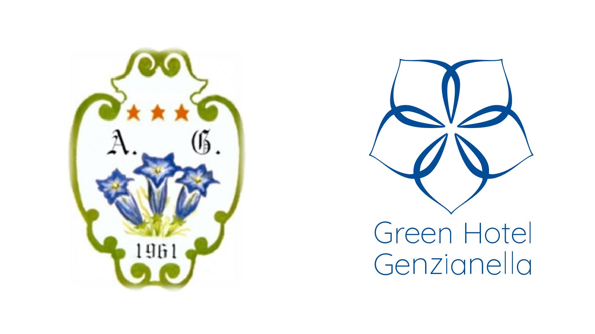
The logo of the GREEN HOTEL GENZIANELLA is the gentian, an Alpine flower which is said to represent determination due to the challenges that this bright blue flower faces in surviving in these challenging habitats: rocky terrain, grassy meadows at high altitude (from 700 m up to 2000 m and even higher) and the difficult weather conditions they face there. From the hot summer sunshine to the freezing cold of winter. This makes the gentian, along with the edelweiss, the undisputed symbol of the mountain.
This new brand identity has been created by analysing and studying the old logo with a view to simplifying the old one, using cleaner, softer and symmetrical lines whilst retaining the gentian as the centre piece.
The creative process began by analysing the geometry that nature has given to this flower: the petals have soft lines, the different thicknesses provide movement and delicacy, creating a harmonious pentagon.
In terms of colour, the choice of a shade called Gentian Blue echoes nature whilst the use of the Quicksand Light font gives a unique and elegant style, adding a note of modernity.
